
Challenge
PROMPT
Netflix strives to build platforms where people can connect through their story and share cultures from around the world. For this project, we investigate new ways to help friends and families share experiences with watching content such as TV series and movies.
Challenge: Design a third-party desktop web site or desktop app (not Netflix-branded) where the community can celebrate shared stories together through communal and authentic experiences.
Role: Design main screen and TV/movie description screen
Tools: Adobe XD and Photoshop
Duration: 47 hours
DESIGN OBJECTIVES
• Allow users to discover new content, share recommendations and track watch history
• Create profile page with personalized collections and watchlists
• Integrate links to stream on Netflix and watch trailers
• Encourage reviews and ratings to optimize content search suggestions
• Provide tools and resources to help users find content based on their wants and needs
• Create profile page with personalized collections and watchlists
• Integrate links to stream on Netflix and watch trailers
• Encourage reviews and ratings to optimize content search suggestions
• Provide tools and resources to help users find content based on their wants and needs
Process
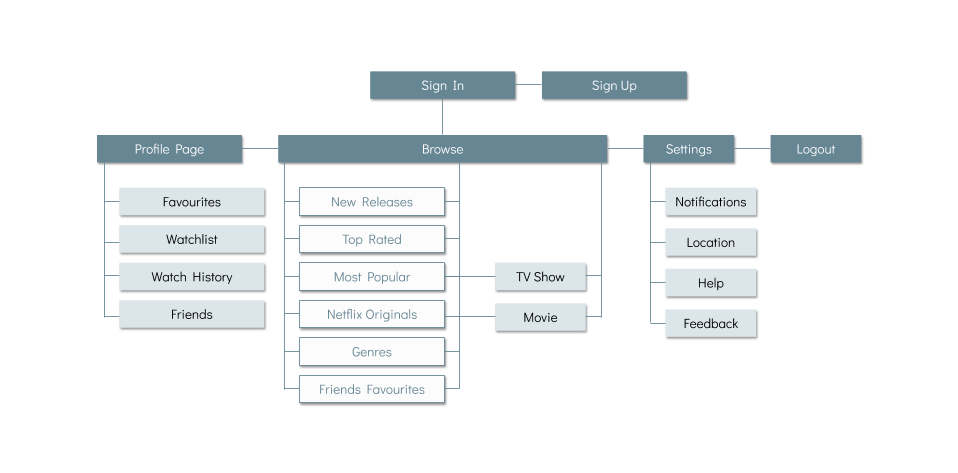
INFORMATION ARCHITECTURE
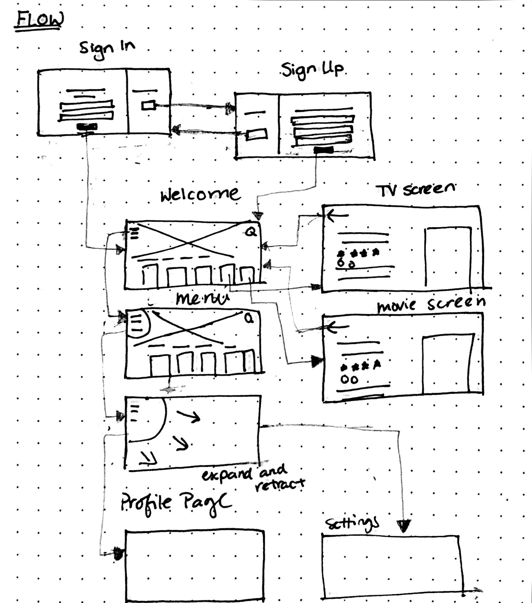
SKETCHES AND USER FLOW

Solution
Due to pandemic restrictions, many people are spending more time streaming and looking for new movies or tv shows to binge-watch. Based on our knowledge and research, we found that most people tend to do the following actions in order to find new content:
• search for content based on their favourite actors, directors or production companies
• ask friends and family members for recommendations
• read top charts, reviews and articles from critics
• decide on a movie/tv show based on plot summaries and trailers
• ask friends and family members for recommendations
• read top charts, reviews and articles from critics
• decide on a movie/tv show based on plot summaries and trailers
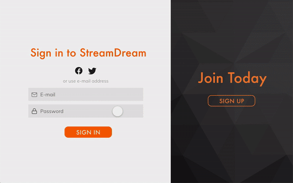
While taking these into consideration, my team and I designed StreamDream, a third-party desktop app that helps users track what they have been watching, discover Netflix content and share their findings to others.
Using micro-interactions to delight the user
Adobe XD is a great platform to explore hover states and auto-animations. For a desktop application, we found that it was crucial to make prominent hover states to help users better navigate within the interface. To add a unique element to our design, I integrated an auto-animated menu that expands and retracts when switching to a different page.
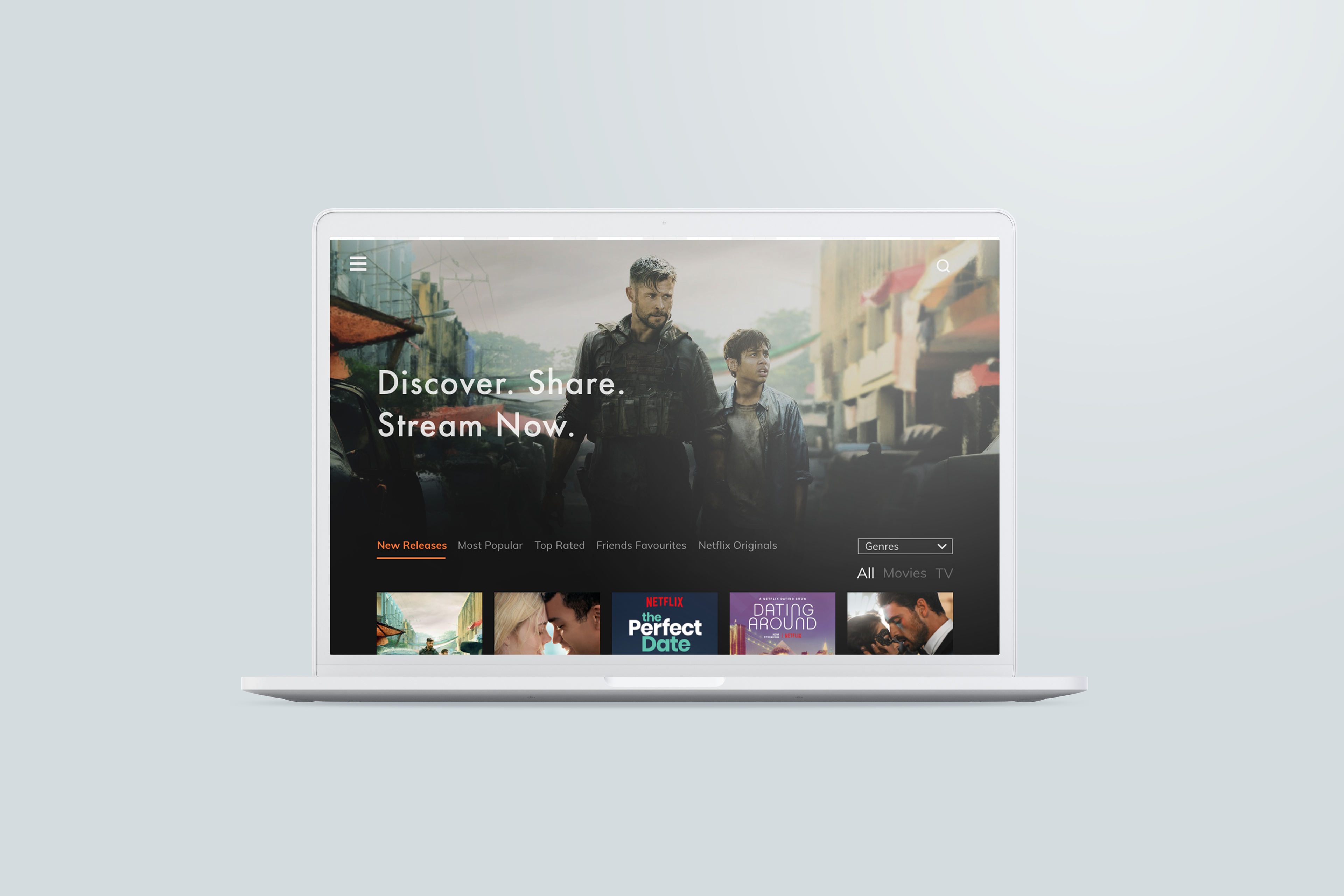
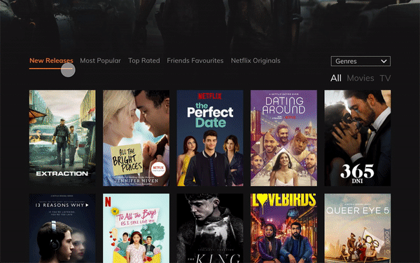
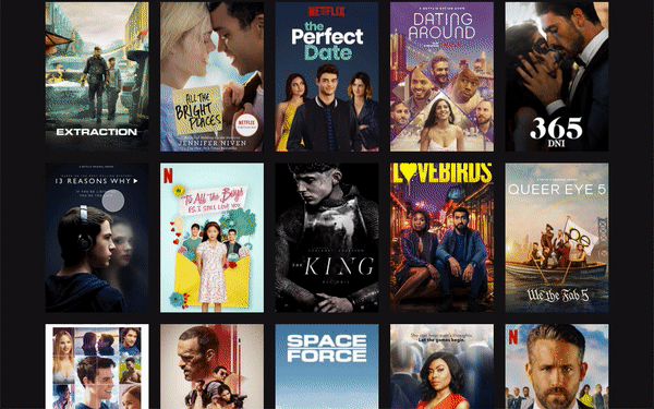
Main Screen
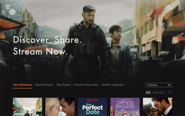
Menu
Metadata Fields
Discovery options
We wanted users to be able to search content by specific metadata fields, including new releases, most popular, top rated, genres, friends favourites, and Netflix originals.
TV and movie description
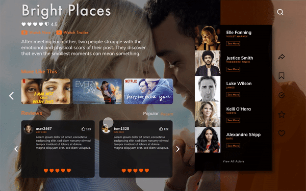
When clicking a tv show tile, in this case the 13 Reasons Why series, there is a plot summary of the latest season, a list of the main characters, along with links to view previous seasons. In fact, the "View All Actors" will lead users to the official IMDB page of the TV show.
TV Show Description Screen
Stream, save and share
Users can watch a Youtube trailer directly within the app as well as stream the content on Netflix. On the right side, there are variety of buttons that allows for sharing and adding to a personal watchlist, watch history, and favourites collection.
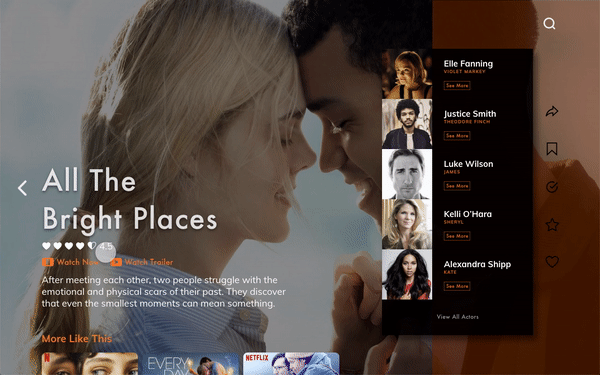
Movie Description Screen
Reviews and Ratings
Key Insights
What I learned
During this competition, I found my passion for UX/UI design and created my first high-fidelity prototype. Working within a restricted amount of time helped me learn best practices for Adobe XD in order to complete the final design in a timely manner. This experience has given me a glimpse of the UX design process and I am eager to continue learning with a newfound curiosity.
What I would change
• Design walkthrough screens that give a preview of main app features
• Incorporate more ways to interact with other users within the movie/TV description screen
• Add more features such as a behind-the-scenes section with character insights and storyline facts
• Identify gaps and find innovative ways to bridge touch points within UX ecosystem
• Incorporate more ways to interact with other users within the movie/TV description screen
• Add more features such as a behind-the-scenes section with character insights and storyline facts
• Identify gaps and find innovative ways to bridge touch points within UX ecosystem