
Role
With RedDice Media, I had the opportunity to create three stylescapes for Fika Beauty, a Toronto-based beauty studio, to reiterate the client's vision and provide them with visual solutions.
Tools: Illustrator and Photoshop
Process
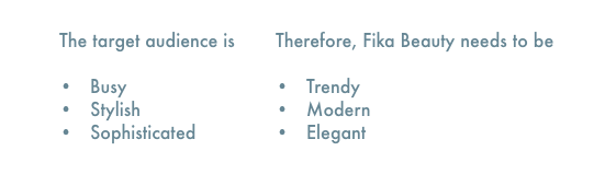
Stylescapes contain visual elements that convey a specific aesthetic and theme. In this case, themes will range from mild, medium and spicy, all of which, are options for the client's creative direction. After reviewing the client's inspiration pieces, I was able to get a sense of their preferred colour palette, shapes, and patterns. I also took into consideration the following attributes:
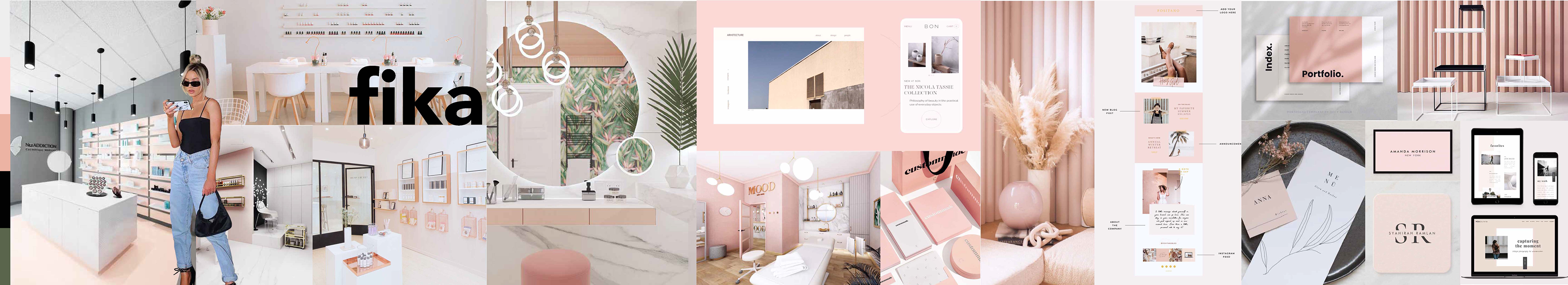
MILD
In this stylescape, we meet the expectations of the client and strongly consider their preferred colour palette and inspiration pieces. I've included images of interior designs, a character representing the typical consumer, prints, and mobile/web interfaces.
MEDIUM
We take a deeper dive into new ways to use the client's preferred theme. Therefore, I decided to shift some of the primary colours into secondary colours and introduce a serif type font. The overall look has a lower contrast and larger negative space in comparison to the mild stylescape. This will allow us to get a stronger sense of minimalism and elegance.

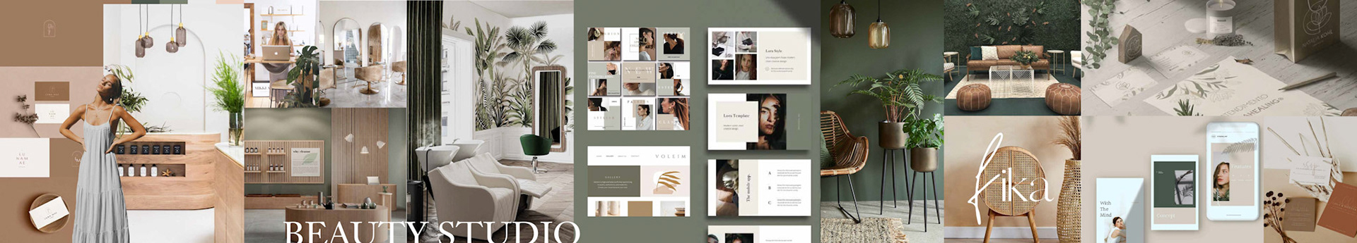
SPICY
The spicy stylescape captures an exaggerated way to show the client's preferred theme. I wanted to put forward warm and earthy tones in the colour palette. I also found that the greenery and wooden objects presented in the image conveyed a bohemian aesthetic without losing the modern attribute.
Final Thoughts
I believe that the final stylescapes each communicate a cohesive aesthetic. For future projects, I would further explore different ways to integrate brand attributes through visual elements (i.e. typeface, patterns, shapes).
This experience has helped me improve my creative process, photo-manipulation skills and ability to identify images that best fit the wants and needs of the client.